
The angle in which I have taken this from it makes her look short as it is looking down on her. I didn’t do this on purpose and if I was to recreate it I wouldn’t do it again I would do it either looking up to make the model look taller, or straight ahead. However the style of the clothes has given of the right effect in which I hoped it would because she has that “geeky” look via the long skirt, and long tie. The reason why I put her in these clothes is because they contrast with the other “school girl” pictures.
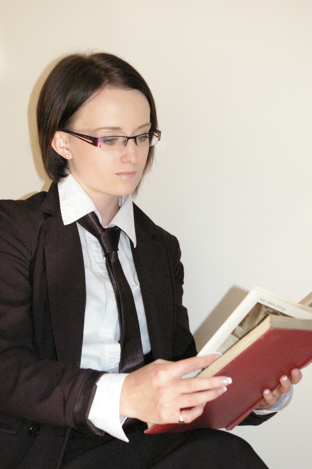
I composed this image on purpose, especially with the pose because it shows the on looker that she is reading, and having a hard back book makes it look more intellectual; however you can see the shadow of her on the wall behind. The pose has given the right effect I just need to get rid of the shadow. This could either be Photoshopped out or change the lighting so I get it.

You can see the difference in colour between the floor and the wall and you shouldn’t be able to tell a difference – it should just be one smooth colour behind, so it doesn’t draw attention to it, keeping the main focus on the model. If I was to redo this I would do it in a studio with a train. Also I don’t like how you can see the corner of the wall. The style has done what I wanted and you can see the contrast between this one and the past two. Changing the glasses has made it more modern and this is the same with the tie.


With these two images you can see the difference the belt and heels make. I prefer the image with the belt because of the model is smiling and the style of clothes is better, that belt makes all the different and add just the effect needed. Once again I don’t like how you can see the flooring.

The styling of this image, it is so casual but I feel it works so well because like the title says it is a typical Photoshoot, so they always have a casual style one. I wanted to try different outfits, casual to formal – and see if any one worked better. The pose also looks really relaxed which adds to the casual feel of the image. Having the shoes undone gives it a rustic look and a unique style. I have tried to recreate Rankin where he did such tight cropping with most of his images.

I have cropped out the models hand because the styling doesn’t look correct because it shouldn’t have been done indoors – it should be done out on location, such as doing it down the beach, so I just took the image to get a sense of what the styling would be like. Having the weelies on really adds to the feel and mood of the picture. If I was to redo this image I would give the model bigger hair, just like Aashith Shetty has done.

The composition of this photo I didn’t do on purpose. The pose I doesn’t work with the styling, they are two completely different things, which when combined into one photo doesn’t look correct. I would change is the flooring and having the models hair bigger – more of an animal. Maybe even do this out on location and make a day of it, like Bora Tarhan did.

There is a purpose to the styling of this image, having her shoes undone give the photo a rougged look and it’s also quirky and different, a bit like some of Rankin’s work – just a bit more subtle than his - I took him as inspiration. If I was to redo this, I would give the model more volume in her hair to make it a bolder statement and make her look more rougged. Also I would do it in a studio so there wasn’t the change in colour from wall to floor.

This image looks so formal, once again I took Bora Tarhan as kind of an inspiration for this image by the fashion she is wearing. It is so simple and yet so bold. If I was to do it more like her I would add more accessories and add another colour for them so they could contrast or clash. The way this image is composed doesn’t work, especially the pose - she is turned to much to the side and I am cropping her elbow out.
No comments:
Post a Comment