 This is how I had the studio set out in my lounge. I moves all of the lights about and changed the settings, got rid of the umbrellas and tried different things to see what worked. I had to do this for the different outfits and different poses. It was always just a test and see what happens. It never matted if it went wrong because I could just move it again and try something different.
As you can see I moved around the lights, made them higher / lower to see what made the best shadows and effects for the image. I am really annoyed how we didn't have the train for the background because it meant we couldn't do long shots.

As you can see this image isn't exposed correctly and the background isn't pure white it has a slight pinky shade to it. This could be because of the lighting or the exposure time wasn't correct. The pose looks very uncomfortable and unnatural. As well, I don't know how I managed to do this, but I'm guessing it was done through the lighting, her legs arms and face are all completely different colours. The styling of this image really works and the small subtle belt adds so much emphasis to her small waist. The hair really frames her face, however if I was to redo this I would have given it more volume and make it bigger and better.

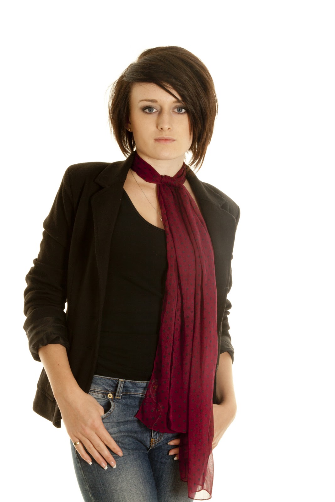
There is one aspect of this image which doesn't work with the composition of it. The hair at the left hand side looks messy and the model looks very smart, so this composition contradicts itself. The pose works however if I was to redo this, I would change the colour of the vest top or the blazer. This being because both of them being black means they blend into each other and they don't stand out. It is very plain - this is the reason why the scarf works so well, because its so bold and stands out. I styled her in jeans because I wanted to try and make it look casual smart - the smart being the blazer the casual being the jeans.
This pose and hair is a lot better than the one above. The hair is flatter yet with volume. The pose is a lot more casual and the scarf is the boldest part, which works as a leading line up to the models face. The red of the scarf compliments the pink in her lips and bring them out. This is enhanced by the model having plain facial expression. If I was to redo this I would only change the styling slightly and that would be to add a thin belt to the jeans in either the same colour as the scarf, so that compliments it or I would use a colour which contrasts and clashes with the scarf, just as Aashith Shetty uses clashing colours to make it bold and stand out.
 I tried to do a very smart picture here however with a twist and to use a simple prop, just as Fred Fraser does. I don't think the prop works well in this instance and the pose isn't great. If I was to redo this image I would keep the styling and the hair - maybe have bigger eye make up, but either get rid of the chair completely or just change the pose, because it isn't very flattering for the model and not very lady like. The white of the eyes, the top and the background compliment each other nicely and make this image bolder and brighter, this is contrasted with the black of the jeans and the dark colour of the hair. This is why the chair doesn't work - the colour doesn't do anything for the image and looks out of place.
The pose of this image is a lot better than the one above, and in this instance the chair works, it is slightly there, not the main focus and it is in the background instead of being in the foreground like the image above. The pose also works well in this image because there are so many different leading lines, and the hair gives the photo texture. I have tried to use the rule of thirds however it isn't the strongest in this image - it is still there though. What does work well for this image is how straight the lines are and not wonky along the image - E.g the bottom / seat of the chair.

I find the pose on the above image stronger, because there are more leading lines, however this one still works. It is definitely better to have the chair like this and in the background instead of being in the foreground for everyone to see as the colour isn't correct. If I was to change this I would change the lighting because the shirt is starting to blend into the background and get lost ( the right hand shoulder).

The lighting of this image doesn't work. It has caused shadows on her jeans, which makes the top part light black and the bottom part dark. This is quite dramatic and takes the attention way from the models face. Also the fringe doesn't look correct with the piece of hair which is half way across her forehead. It needs to be clipped back so you can't see the forehead, then it would good because it would work as a leading line. The eyes in this image stand out and the pink of the shirt compliments her pale skin tone and plainness of her lips, eve though the red of the scarf makes the lips a bit darker.

The eyes in this image are what stand to me first of all when I look at this. This is because the model is giving the camera eye contact, which when saved it looks like the model is giving you - as an on looker, eye contact, meaning this image is something personal. The black of the top underneath compliments the black of the collar. The white of the lace top compliments the white of the background. This top where it is lace, also adds texture to the image. The hair does this as well, where is has so much volume to it. The black eye liner really brings out the white in the eyes and frames them nicely.

This pose works so well for this image. I took inspiration from Daniela Silicz. She uses such simple poses but they also come out having a strong meaning - that is what has happened here. The black of the shoes compliments the black of the skirt, top collar, hair and eye liner, the white lace top compliments the background and stands out against the amount of black used in the image. This picture would look so much better if there was a train to the backdrop. The splash of colour from the belt really works and emphasise how small the models waist is.

This image is my favourite from this photo shoot! The eyes stand out so much and look amazing. The white of the background compliment the white of the eyes and then the pupils stand out. It is also enhanced how she is giving the camera eye contact and the eye liner around them frames them. The composition of the hair works well where it is so volumised and big. The pose, looking over the shoulder is very simple but very bold.
No comments:
Post a Comment