

This image is quite comical, because of the pose of the model. We wanted to try something different and it worked to an extent. If I was to recreate this image I would have the model hold the glass up - as if she was making a toast, however loose the left hand because this is what adds the humour to the picture and they are meant to be quite sensible.

There are a couple of changes I would do to this image, the first one being to edit it better and to give the model one strong simple colour for her skin - her tan lines show up in this lighting. I would change the hair because it looks very flat and quite messy when I needed it to look proper and nice. I would want the model to have bigger hair so it framed the face more. I would either change the lighting so that I could get the whole glass in - make it look 3D instead of 2D or I would change this in the editing process. The background isn't pure white in this image, so it doesn't have the professional look I was going for. The pose of the model works well and arm is being used as a leading line. I once again took inspiration from the photographer Bora Tarhan and that was to keep the props simple and only use one - she used a camera I used a champagne glass.

I tried a different shot here, and tried to get more of the models body into the picture. Personally I feel it hasn't added much to the image. I have over accessorised the model here and I should stick to one bold prop - either the necklace or the glass. There are both positives and negatives about the pose of the model, the positive is the arm on the hip is working as a leading line drawing the on lookers attention to the models face, this is also emphasised but the other are pointing upwards. The negative is where the hand is on the hip, it is pulling the dress in and down giving the model a stuck out stomach, which she isn't fat and shouldn't be there. This detracts from the models face. The hair and make up in this picture work because they are neutral and nothing bold.

The mask in this image frames the face, however more importantly frames the eyes, which is what I was wanting to be the main focus. This is also helped where the mask is such bright colours it attracts the audience's eye to it. If they weren't drawn to it straight away then the holding straw is working as a leading line drawing your eyes upwards. The hair in this is big and catches the on lookers attention but frames the face really well, going all the way down to her shoulder. The black gloves compliment that blackness of the dress. Once again I have been inspired by Bora Tarhan t do this, where she did the white of the gloves with the white of the models collar.

This is the edited version of the picture above. I have done it in black and white, however changed the contrast slightly and make it more dramatic by making the blacks blacker and the whites whiter. This was one of my idea, which I had to begin with, and that was to have a statement colour on one of my photos. Here I feel it has worked really well because it draws attention to the models face. Although the eyes are the main statement anymore I feel it is a stronger statement that the picture above. I know the editing of the statement colour isn't perfect however I recon this adds a dimension to the picture and means looks better.

With this photo, I would have to change the lighting because the top of the mask, where it is white, blends in with the pure white of the background. Also it is causing shadow on the models face, which is causing it to hide away, and not be the main focus anymore. The pose of the model accentuate the models face because there are two different leading lines. One being the arm, as you follow the glove up this leads to the face. The other being the mask itself. I have kept the colours quite minimalistic and simple because I want the face and mask to be the main focus and not the body ( hence the plain black dress.)

In this image I was trying to capture the model turning and to get the movement in her dress, however you can see it didn't work too well. I needed to use a faster shutter speed and for her to turn more slowly. I captured some movement however it is quite blurred.
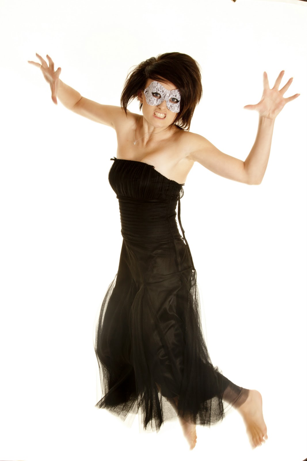

 Here I have tried to capture a spinning shot. It has worked to a degree however it also hasn't. When I borrowed the studio of the photographer I work with, unfortunately he forgot the train to the background, this meant it was hard for me to do long shots, and full length shots as my carpet was a completely different colour to the background. If I did decide to do a long shot this would mean I had to Photoshop the carpet to be the same colour as the backdrop.
 This photo works so well apart from the floor and the backdrop. Th models expression is perfect, a slight smile. The models pose is amazing, with the back having a slight curve to it. The arms looks so graceful and like a dancer. I managed to capture the dress at a perfect time and make it look like it has loads of texture. The only other problem is one of her straps have fallen and is by her left arm. This is very noticeable.

This is my favourite picture to come out of this photo shoot. The eye make up is so subtle and yet adds so much to the image. The hair looks stunning and perfect - it frames the face nicely. The eye brows frame the eyes nicely, along with the make up. Everything about the composition of this works. The shoulder works as a leading line up to the face, and having the model looking out of the image draws you eyes downwards. The small necklace is a quirky little prop that adds so much to the image, just being there, otherwise she would have looked too bare.

I prefer the image about however once again having the model looking to the bottom right hand corner draws your eyes to there. The hair is lovely in this and is styled so big.
No comments:
Post a Comment