Sunday, 29 January 2012

Referencing my essay.

Aashith Shetty images -
Amitha Chittor spring-summer 09 on Fashion Served. 2012. Amitha Chittor spring-summer 09 on Fashion Served. [ONLINE] Available at: http://www.fashionserved.com/gallery/Amitha-Chittor-spring-summer-09/333392. [Accessed 29 January 2012].

Daniela Silicz  images -
Daniela Silicz on Fashion Served. 2012. Daniela Silicz on Fashion Served. [ONLINE] Available at: http://www.fashionserved.com/gallery/Daniela-Silicz/99562. [Accessed 29 January 2012].

Fred Fraser images -
Plugged In on Fashion Served. 2012. Plugged In on Fashion Served. [ONLINE] Available at: http://www.fashionserved.com/gallery/Plugged-In/287277. [Accessed 29 January 2012].

Bora Tarhan images -
 Hotel 65 on Fashion Served. 2012. Hotel 65 on Fashion Served. [ONLINE] Available at: http://www.fashionserved.com/gallery/Hotel-65/1630541. [Accessed 29 January 2012].

Quotes -

Diane Arbus -
American Photographer - Photo Quotes . 2012. Diane Arbus - American Photographer - Photo Quotes. [ONLINE] Available at: http://www.photoquotes.com/ShowQuotes.aspx?id=90&name=Arbus,Diane. [Accessed 29 January 2012].

Richard Avedon -
American fashion photographer Richard Avedon - Quotes and wisdom about photography . 2012. American fashion photographer Richard Avedon - Quotes and wisdom about photography. [ONLINE] Available at: http://www.photoquotes.com/showquotes.aspx?id=52&name=Avedon,Richard. [Accessed 29 January 2012].

Imogen Cunningham. -
10 Photography Quotes that You Should Know . 2012. 10 Photography Quotes that You Should Know . [ONLINE] Available at: http://www.digital-photography-school.com/photography-quotes. [Accessed 29 January 2012].

Fashion in Photography essay (without images, see printed out version for images)

                                                                Photography in Fashion               


“I’m a little fool hardy. Dangers of violence, rape and murder – are less frightening than making a living in fashion photography” – Dianne Arbus


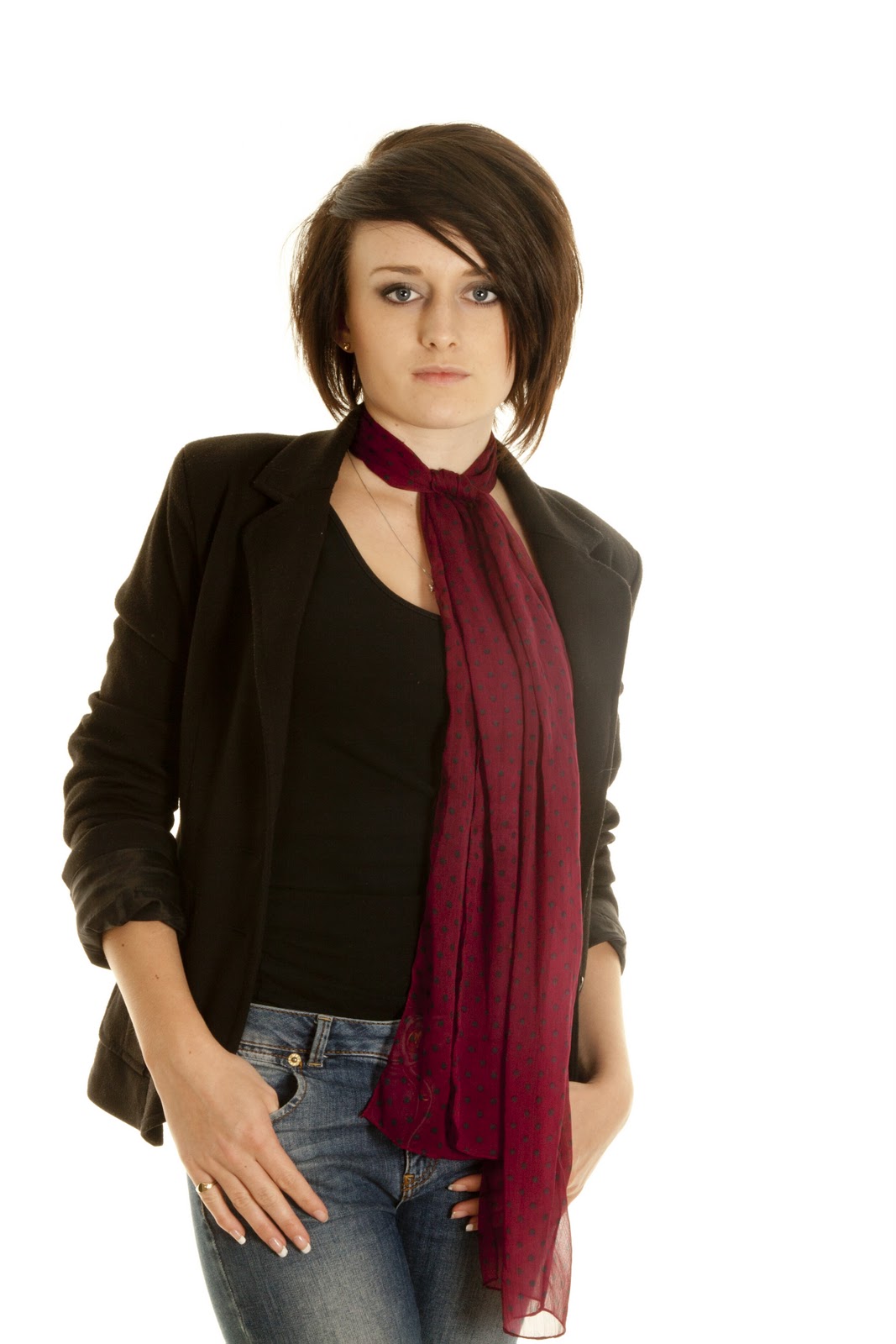
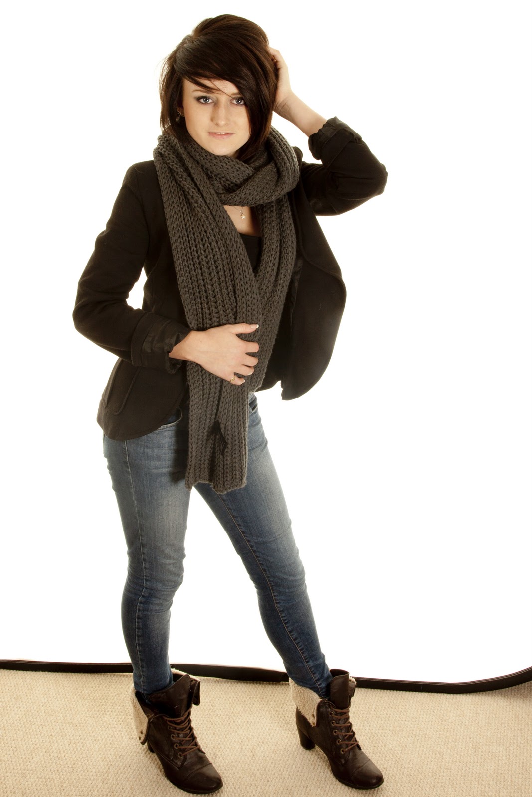
The idea I am going to explore, is all different fashion styles, and poses - to experiment with what works best.


The different aspects of fashion photography and which I would most like to recreate are; different eras, such as the 60’s, 70’s, 80’s and 90’s. I plan on recreating these, by the different styles which my model would be dressed in, her hair and makeup, and the props which would be around her. Another idea which I would feel would give a different aspect to fashion photography is doing jumping shots. I could go one of three ways, the first taking shots of different people in mid-air, jumping and putting them together in an imaginative way , perhaps in a circle. The second idea is getting different ages doing the same jumping shot, however putting them together in a sequence as it goes up in age. I believe this could be quite quirky and different and an idea which not many other people have pursued. My third idea is to use props; I can combine this idea with some of my others, to reinforce my point. I would like to use mirrors as a prop for one of my photo shoots because I like the way which you can change and do different angles with the reflection from mirrors.


“My portraits are more about me than the people I photograph.” – Richard Avedon.


The four main artists which I am planning on researching are; Daniela Silicz, Bora Tarhan, Fred Fraser and Aashith Shetty. Daniela Silicz uses props and mirrors, which links into my themes. She also does jumping shots. As illustrated by the images below, which are her work. With the image of the jumping shot, she has used the rule of thirds. She has cleverly placed the person on the third line, and has chosen to have her looking into the picture because it draws the viewer’s eye into the middle of the picture. She has also used the rule of thirds when it comes to the background. The tall bit of building on the right hand side is on the third vertical line, and as well the building which is horizontal is on the first rule of third line from the bottom. This therefore means there are two thirds of the plain skies in the furthest background. The main reason why the model is in the foreground is because Daniela Silicz wanted her to be the main focus of the image. The purpose of the image being dull dark, black and white colours is because it reinforces the aim which she is wanting to correct. Additionally it makes the look of the building more dinghy and has more of an effect of human presence. The wall in the background,  works as a leading line, drawing the on lookers attention to the model herself. This is the same for the TV areal.


 I love the image of the person using the mirrors. It uses many different photographic skills, some being such as it using the rule of thirds. The top of the mirror is on the top of the first horizontal line, and the bottom of the mirror is on the last line, this then concludes that the mirror is in the centre of the image. Also the side panels are directly in the middle of the vertical rule of third lines. This then leaves the mirror and the model being in the centre of the image. The mirror also works as leading lines in this image, drawing the on lookers attention to the models face. I feel the main reason why Daniela Silicz chose to plan her picture like this is because it creates the main focus on these two things. The model is in the foreground, the mirror is in the background and the wallpaper adds to the scenery and creates the mood of the picture. The mirror adds a quirky picture since you can see her face in all three, because of the different reflections created. . The way the model is looking up into the light creates shadows on her face, which gives it definition.


The photographer Bora Tarhan, takes his photos by using props, editing, style and lighting. This is shown throughout the pictures below. The first image, I love so much and find such an inspiration. I find the editing and effect of black and white creates the mood of the photo and shows up the lighting and shadowing more, than if it was just normal, non-edited. I also like how the model is dressed in black and white to have the contrast with the editing. The styling of the picture is extraordinary, the big hat matches the dress, however the centre of the dress matches the gloves. The tons of the hat are darker than everything else, which emphasises it and makes it stand out amongst the image and the other components.  The shadowing behind the model  really accentuates her hat, and the shadowing on her face makes her cheek bone stand out and makes her look really feminine to match her outfit. The model is in the foreground to make her standout and the shadow of her looks like it’s in the middle of the photo and the light on the wall is in the background. The photo slightly uses the rule of thirds, the light is in the top third of the horizontal line. The two lines going down then dress, with the criss 


My favourite part of the next  picture is the props which are being used. The typewriter is my favourite part; this is because it’s so quirky and different. It also tells the story of the picture and shows the eras. The glasses contrast the dress, however the pattern of the dress, clashes with the spotty pattern of the sofa, so this makes the colour and the pattern stand out a lot more. The colour of the curtain in the background makes the light stand out. This picture has used the rule of thirds, the top of the light and the typewriter are on the 3 points to the right hand side, and the model is two thirds of the picture. I don’t like how at the right hand side corner of the image, in the foreground you can see a corner of the second sofa. I think it detracts from the photo and doesn’t make anything of it. Personally I feel the image would be better without it as it makes your eyes go there, instead of on the main focus of the image.


Fred Fraser is a photographer who works with a hair stylist/ makeup artist/ props director called Liz Dungate. They mainly focuses on her styling, and the poses in which the models are in, to emphasise the image. The first images use natural colours to make the shadowing stand out a lot more. The prop is there to make it quirky and different. It emphasises the pose and the model and makes this picture original. The way the model is posed uses the rule of thirds. The body being higher draws your eye to the face, however you first see her legs then the straight one draws your eye up to the body. Then the body draws it up to the face so you get a sense of the whole picture. The big hair black hair makes a statement piece for the image. She is very thin and this adds to the picture. I feel it would give a completely different look if it was a larger model doing it; It wouldn’t look correct.


The second image of hers which I like is the one with the woman praying in front of all the TV’s. The line of vertical TVs draw your eyes down to the woman praying with the beads entwined in her hands. The only thing I don’t like about this photo is the picture in the middle of the red wall. I understand that if that painting wasn’t there then it would look too bland and wouldn’t look correct however I personally feel it detracts the focus from the model and the TV’s which are the main elements of the image. If that painting wasn’t there then I feel it would be such a good image because the TV’s are on a third line and they draw the viewer’s eye into the picture, which draws it to the woman who is praying. The dress which she is wearing draws  your eyes out as it is in the bottom third and going out of the picture all along the bottom, so your eye follows it. The brown belt in which she is wearing blends in with the brown of the old middle TV. The only bold colour is in the background and it is the colour of the walls.


My final photographer who I have researched is Aashith Shetty. The reason why she is such an influence to me is because she mainly does jumping shots, with bold fashion styles which clash. She also does them in a studio, on a plain background, which is what I am hoping to do for my final piece. I love this photo because the jump looks so natural and so relaxed. It looks posed but not too over the top. I love how he has chosen such bold colours which clash, such as the pink tights and the red scarf, however they work so well. I like how the background is plain so that the focus is on the model and the model only. I also really like the hair; it’s such a bold statement in itself. It adds that finishing touch to the look. Also the bangles and bracelets on her arm make it look natural and un-posed. I think the reason why I like this photo so much is because it looks casual and something which the model would wear out and about, so she doesn’t look uncomfortable in it.


This is the same for the second picture. The purple and the yellow clash when put together. I like this photo more than the other one, because the jump is a lot more natural and I prefer how you can see both feet instead of just the one. At the same time I like how, he has managed to create a line with her body, which draws the attention of the viewers eye. If you go from the foot in the foreground and up, he has managed to create a diagonal line by tilting the head back. Once again the hair adds a new dimension to the picture, and it wouldn’t be the same if it wasn’t an afro.


I have many ideas for my final piece; some being, to make people of different ages in a jumping shot, but all the different aged models to be in a sequence. As the ages of the models progress, I am planning on changing the ear of the styles. For example if I start off with a girl the age of 5, then she will be dressed in 50’s styled clothes. The next on the sequence I would have a 12 year old girl, dressed in 60’s clothing, and so on. I could present this in a circle so you get the full effect.


Another idea, which I personally find my strongest, is to go one of two ways. The first route I could go down is to take a photo shoot of a human being a Photoshop Barbie doll arms, legs – different body parts onto it. I could swap this round and take a photo shoot with a Barbie doll, and Photoshop some human body parts onto it. The gives it a quirky effect, and makes it a bit different, such as the photographer Rankin does. This is the idea with I am going to explore for my final piece. This idea came from a blog which I found online, when trying to develop my idea. This blog was called Sex Sells, which was on fashion served.

Sex Sells is an online blog, which has images of models with Barbie body parts. I have used this as inspiration and this is where my idea for my final piece came from. It is so quirky and different. This blog used different body parts and so I am wanting to recreate this.


I am aiming to achieve a sequence of high quality photos, which have a professional but quirky look. I hope that all my images will have good editing skills, and be unique to my own personal style.

For my final piece I printed out the three images, and stuck them together in a 3D triangle. The reason for this is because it means you can easily see all three. As well I want it to be hung up from the ceiling - which is the reason I have attached string to it. By doing this means you are giving it the room to spin and see all three images, instead of just focusing on one. The reason why I have backed it on white card is to strengthen it, so you can't see any joins.

The choice of the three images, are because they work the strongest and show the development I have been through to get to this point. The one of the Barbie, is because it was my original idea, to have a Barbie main part and a subtle human part. So in this case, there is the Barbie face and hair, however she has human eyes. This gives it a quirky little twist.The reason for the next image ( the one with the Barbie legs) is because I personally feel this is the strongest image out of them all. There is perfect shine on the legs, telling the on looker that they are plastic, and not real. The image of the model is one of the first one I took, however I have modified and developed it, to create it unique for my final piece.  The picture itself worked however, it was a bog standard portraiture image and I wanted something different. The final image out of the three is the one with the Barbie arm. This was a great image to begin with and has been enhanced by the idea.


This is such a strong final piece, because of the way it is set out the way the images look. If I was to redo this, to give it a higher mark and make it look better, I would spend more time on the Photoshoping of the images, as this is the aspect which I feel let them down. I would make it more precise and make everything flow a lot better.

“Which of my photographs  is my favourite? The one I’m going to take tomorrow.” – Imogen Cunningham.

My final Pictures.


Human with Barie parts.


Here I have tried to recreate the sex sells idea with the legs however, by having the legs next to the model, hasn't come out as strong as I would have hoped. So for my next image I have deleted that aspect.
I have used one of the image which I have taken in previous photo shoots and added some barbie legs onto her.
This is a stronger image because the shine on the legs gives it away that they are false.
The use of a casual image makes it look as if it is normal to be like and an everyday sight.


Here I have used an arm of a Barbie. It hasn't worked as well and isn't as strong. The colour is completely different and the joining of it is very unprofessional. The angle of the arm works but that is about it.


Barbie with human parts.

This Barbie has human pupils. Its not that ovbious so it wasn't my strongest idea. It looks good where it is a close up on the face however it is hard to put human parts on it and blend it in.
I have modified this image slightly and to make it a bit more human I have tried to give it human glasses, although the angle of the Barbie doesnt work with the glasses.
It makes it look more human, but not yet as strong as the Sex Sells images. By having the glasses it shows that the Barbie has human pupils but its still not that good.

Sex Sells Idea.

"Sex Sells is a fashion story, treating about how sexuality is distributed in modern society.


This set of photographs out pressure on the paradoxical setting of children's toy and fashion, as symbols and mediums for 'selling sexuality."
^ Quote from http://www.fashionserved.com/gallery/Sex-Sells/2247088
As you can see this model has Barbie legs. This is emphasised by the out of focus Barbie legs and body next to it. This is very quirky and different! I love idea of it because it isn't obvious however it is still there. As being an on looker you don't notice it immediately.
I wish to recreate this with my own pictures however i know it is going to be difficult. I want to try and recreate it without having the legs next to it, so it looks like a normal portraiture, however it may have to have the legs because it may not be that obvious to the audience.


 As you can see here the part of the Barbie this one has is the arm. This is a bit more obvious than the legs because you have the joint on show.
This works because you can still see that it is a human back - with the spine showing.
To recreate this it will be very hard as you will have to get the correct angle on the model and then the same angle on the barbie and Photoshop it in.


 This image is a very weird one, because it has the Barbie face! When you first look at it, you know there is something wrong but you cant figure what it is out. Then you notice that it is a Barbies face, it is the eyes you first notice, this is because of the strong blue colour of the pupil. The hair is still the same and the rest of the face look half human, so its very odd to look at.
This must of taken a lot of time on Photosohp to recreate because they had to get the same colour skin for the Barbie and then human. This is what I am going to struggle with.


 This is the most obvious image out of them all, and that's because the model / Barbie isn't wearing any trousers so you can tell straight away it is the Barbies body and legs. The shine on the stomach gives away the fact that it is Barbie because this gives it the plastic look. The joining of the human skin and Barbie skin has been done professionally because you can't see it at all. You can also see the join between hip and leg - this proves it is the Barbies body.

This is the type of portraiture I am wanting to recreate for my final piece. It's going to be difficult but if I get it correct it will look so effective and unique.

I want to try and create this into my own style so try doing human body parts onto a Barbie ( so the other way round) to what this has done.


Film camera - Barbies and Ken

This is some of my negatives from my film camera, photo shoot. Most of the images came out really well and correctly exposed, however some came out quite blurred. I developed this film straight out of the camera - so I did every aspect of it. It was a relief when it came out correct.


Before printing in the dark room, I did a test strip. I had the enlarger on a very bright light, so this test strip was done in 2 second sessions. The first block is 2 seconds, the second 4, the third 6, ect.
By looking at this I would have said about 4 - 5 seconds gave the clearest detail. So that is what I put my enlarger on.


This is the outcome of the enlarger being on at 5 seconds. The dolls house has come out very clear and in great detail, however the miniature figurines have come out very blurred and out of focus. The reason for this was because this what it look like on the negative - it wasn't the printing which did this.


I kept the enlarger on 5 seconds and did a different picture. This image came out very clear however it is slightly too dark for what I wanted. This has given very clear detail, however also it looks as if I have just cropped the Barbies head off - I haven't the Barbie had no head to begin with.  >


< I redid this image with the enlarger on 4 seconds and slightly further down. This image is a lot better in detail and looking.


This image was done on a 4 second enlarger. It has still come out very dark, so I needed to change the f number on the enlarger. I love how the Barbies look like real people and how the styling matches. I like how it has been printed in black and white like I  wanted to in the beginning and how I have used different gender models ( Barbies and a Ken) .


I have tried to be really controversial here, by switching the clothing. So Barbie is in the mans board shorts and Ken is in a dress. I did this too see what the outcome would be like. It isn't great and it isn't my favourite image, however it was worth a try because it's so unique. I don't like how closely cropped it is and I wouldn't try to redo this, I would just leave it as it doesn't work.

Fashion with a twist.


This is a very subtle image. I have used leading lines going down the path, to the model who is stood at the end. The path works as a leading line because it stands out as isn't covered in leaves. The reason why she is in white, is because it means she stands our against all the dark colours of the forest. The tress curve inwards framing the picture round the top.

This image works well because, where it is so light you can see all the face painting and can see that she isn't a human. The white stands out against the body and makes something that isn't pure - perfect. There are some leading line, the bridge itself works as one because it draws your eye into the background. The background is done wonky because I wanted to try something different. The rustic bridge gives it an authentic look, and something a bit quirky. Rankin inspired me to do this.


There is a shallow depth of field in this image. The reason why I have chosen to do this is because I want the main focus to be on the 'creature' and not the backdrop. However the background sets the scene nicely and works really well as it is so bright, which compliments the white of the mask and dress. This contrast with the darkness of the skin and the hair. I have done this image on a wonky angle because I wanted it to seem a bit unrealistic which the model stood upright but the background not to be.


I wanted to try having the creature in the mud - where they are supposed to be. At this angle the models skin is very clear and you can tell it has been face painted. The facial expressions - where being angry work really well because it gives the model an animalistic side to her. I have tried to compose this image with the rule of thirds, however it has given too much focus on the background.

This image is very well composed, however if I was to redo this, I would get rid of some of the background - personally I feel there is too much - which detracts the attention away from the model. As well, the model would have bigger hair to make it a bit more unreal, and so she can get more into character. The pose and facial expressions work really well and tell the story to the audience.
 
I have tried to compose this image with less light, because I wanted the model to blend in more to the background. Also by having less light it brings out the white of the dress and mask. I had the model holding onto a branch from a tree, because it make it look as if she is right in the trees and as if it is natural. What I really love about this image is how you can't see her legs and right arms, they blend in so well  with the face paint on them.

I have tried using the flash here. Some aspects of using it are good and other aren't. The flash brings out the white and the eyes / facial expression of the model. However it also brings out the strips of the face paint. However we did a good job and there aren't any skin patches so it look realistic. The flash also brings out the scenery and tells the story to the on - looker to where this creature is.
I composed this image with such a tight crop around the face, so the audience can see the facial expression of the model and the eyes. If I was to redo this I would crop off the other point of the mask. The face paint looks really good in this image and looks really realistic. If I was to edit this better I would make the image slightly darker. so enhance the blacks and also I would Photoshop out the black of the elastic on the white mask.
This image is composed in this way to tell the audience the story of the creature and where 'it lives'. If I was to redo this I would get ride of the only leaf, which goes in between the two trees. I would also make it a lot darker to make it a bit spooky and eerie. The trees work as leading lines bu they also frame the model and the picture. There is a shallow depth of field in this image to make sure the main focus is on the model.


Here I have tried to make the model disappear into the foliage. She hasn't blended in as much as I would have hoped but this image needs to be darker, so when I change that she would fade away and the only aspects you would be able to see if the dress, mask and eyes. The leaves around the top of the image frame the picture and frame the model. The branches at the right hand side work as leading lines to the models but also frame the other side of the image. I was scared this image would look too busy, however it doesn't.


There is one thing that immediately stands out to me about this image, and that is the model has red eyes, where I have used the flash. Once again I need to decrease the whites and enhance the blacks to make this image stronger. The hair needs to be bigger and more animal like. The branch which covers her face needs to be got ride of however the leaves on the right hand side, in the foreground frame the picture and the model. There is also some shadowing on her dress, which where white stands out and looks very unprofessional.


There are aspects of this image which work well, such as the darkness of it, which brings out the white of the mask and the dress, making it look like a mysterious create as that is all you can see. This emphasises on the fashion side of things and not the model and what she is doing. The only problem is this image is too dark, giving away no background to tell the story or set the scene. By having some light in the background shows some bushes, however I know they are bushed, to an on looker they could look like anything so, this isn't as stronger message as I would have hoped to portray.


This is the original image to the one below. At the moment it is too light however the composition of it works really well. The tree in the foreground frames the image nicely and the tree in the background sets the scene for the creature. The leaf with the berries in the foreground is just a quirky little touch. The pose of the model works really well because she is giving the camera eye contact with plain facial expressions. Also it looks as if she is peering round the tree scared, and is gripping onto the tree with her hands.

This is the edited version and this is my favourite image to come out from this photo shoot. the only problem is the skin colour now stands out a lot so you can tell it is face paint.

Saturday, 28 January 2012

Fluffy hat.

This is the studio set up I had for this photo shoot. I wanted to try and get the correct lighting for this photo shoot, because where I was using a fluffy hat for the styling and a prop, I wanted it to add texture to the image and make it look like it was truly fluffy. This would  be done by having lighting going onto the model from all angles. A good example of this is the image before.

One of my ideas from the beginning was to do some jumping shots, just as Aashith Shetty and Daniela Silicz did. I managed to capture it quite well, however the shutter speed needed to be slightly quicker because the models feet are blurred a little bit. This is the only problem with this image, and that happened because I captured it at the wrong time, when the model was still getting her feet in the correct position - so they were still moving. The composition of this image really works because it looks fun, humorous and happy. This makes the image easy to look at. I took inspiration from Rankin because he makes his images fun.


I have composed this image with quite a casual pose. The feet pointing inwards makes it look this and the model looks relaxed and unposed. The hat has some texture however not enough as I would have liked - although I think the reason for this is because it is a long shit and a full body shot, so your not going to be able to get that much detail on the hat. The pom poms on the end of the hat, work as leading lines, drawing your eyes upwards towards the models face. The hat it the main focus of the image.


By having the model looking out of image, means as an audience your eyes follow hers. Also it brings out the white in the eyes because you can see more of it. This is enhanced by having very harsh lighting making the white of her eyes pure white. In this picture the hat gives it great texture and has been captured well, because of the lighting. This frames the face very well, and it hasn't done what I expected it to do - cause shadows of her face. With a lot of moving the lights about I managed to make it so there aren't any shadows on her, and that keep its plain and pure.


This image is the same as the one above, the model is looking out of image. The facial expressions in this image are great because they are so simple and plain but it gives the image such an impact. If I was to redo this I would get ride of the lines, which have the pom poms attached to because they distract your eyes attention.


Once again I have used harsh lighting in this image to bring out the texture of the hat and make the main focus be on the models face rather than anywhere else in the image. If I was to edit this image better I would crop the little bit of legs you can see down the bottom of the picture and the little bit of dress which you can see. I like the coat but I having the dress underneath isn't the style I was going for.


The composition of this image works, because the model is giving the camera eye contact. The hat gives the image texture, however it is not as strong as I would have hoped. The hat also causes some shading on the models face, which detracts from the image and doesn't make it look professional.


This is a self portrait, done with a clicker in my hand. I have tried to be comical with the facial expression to make it fun and easy to look at. I have taken Rankin as an inspiration. I have used the rule of thirds. If I was to redo this I would have harsher lighting on the face to make it stand out more.
I love the texture the hat has in this image. By having a close up shot of my face and by having lighting which cases shadows in the hat, this makes it stand out and makes it look like it is made out of fur.

Fashion in a studio.

This is how I had the studio set out in my lounge. I moves all of the lights about and changed the settings, got rid of the umbrellas and tried different things to see what worked. I had to do this for the different outfits and different poses. It was always just a test and see what happens. It never matted if it went wrong because I could just move it again and try something different.


As you can see I moved around the lights, made them higher  / lower to see what made the best shadows and effects for the image. I am really annoyed how we didn't have the train for the background because it meant we couldn't do long shots.


As you can see this image isn't exposed correctly and the background isn't pure white it has a slight pinky shade to it. This could be because of the lighting or the exposure time wasn't correct. The pose looks very uncomfortable and unnatural. As well, I don't know how I managed to do this, but I'm guessing it was done through the lighting, her legs arms and face are all completely different colours. The styling of this image really works and the small subtle belt adds so much emphasis to her small waist. The hair really frames her face, however if I was to redo this I would have given it more volume and make it bigger and better.

There is one aspect of this image which doesn't work with the composition of it. The hair at the left hand side looks messy and the model looks very smart, so this composition contradicts itself. The pose works however if I was to redo this, I would change the colour of the vest top or the blazer. This being because both of them being black means they blend into each other and they don't stand out. It is very plain - this is the reason why the scarf works so well, because its so bold and stands out. I styled her in jeans because I wanted to try and make it look casual smart - the smart being the blazer the casual being the jeans.


This pose and hair is a lot better than the one above. The hair is flatter yet with volume. The pose is a lot more casual and the scarf is the boldest part, which works as a leading line up to the models face. The red of the scarf compliments the pink in her lips and bring them out. This is enhanced by the model having plain facial expression. If I was to redo this I would only change the styling slightly and that would be to add a thin belt to the jeans in either the same colour as the scarf, so that compliments it or I would use a colour which contrasts and clashes with the scarf, just as  Aashith Shetty uses clashing colours to make it bold and stand out.


I tried to do a very smart picture here however with a twist and to use a simple prop, just as Fred Fraser does. I don't think the prop works well in this instance and the pose isn't great. If I was to redo this image I would keep the styling and the hair - maybe have bigger eye make up, but either get rid of the chair completely or just change the pose, because it isn't very flattering for the model and not very lady like. The white of the eyes, the top and the background compliment each other nicely and make this image bolder and brighter, this is contrasted with the black of the jeans and the dark colour of the hair. This is why the chair doesn't work - the colour doesn't do anything for the image and looks out of place.


The pose of this image is a lot better than the one above, and in this instance the chair works, it is slightly there, not the main focus and it is in the background instead of being in the foreground like the image above. The pose also works well in this image because there are so many different leading lines, and the hair gives the photo texture. I have tried to use the rule of thirds however it isn't the strongest in this image - it is still there though. What does work well for this image is how straight the lines are and not wonky along the image - E.g the bottom / seat of the chair.


I find the pose on the above image stronger, because there are more leading lines, however this one still works. It is definitely better to have the chair like this and in the background instead of being in the foreground for everyone to see as the colour isn't correct. If I was to change this I would change the lighting because the shirt is starting to blend into the background and get lost ( the right hand shoulder).

The lighting of this image doesn't work. It has caused shadows on her jeans, which makes the top part light black and the bottom part dark. This is quite dramatic and takes the attention way from the models face. Also the fringe doesn't look correct with the piece of hair which is half way across her forehead. It needs to be clipped back so you can't see the forehead, then it would good because it would work as a leading line. The eyes in this image stand out and the pink of the shirt compliments her pale skin tone and plainness of her lips, eve though the red of the scarf makes the lips a bit darker.


The eyes in this image are what stand to me first of all when I look at this. This is because the model is giving the camera eye contact, which when saved it looks like the model is giving you - as an on looker, eye contact, meaning this image is something personal. The black of the top underneath compliments the black of the collar. The white of the lace top compliments the white of the background. This top where it is lace, also adds texture to the image. The hair does this as well, where is has so much volume to it. The black eye liner really brings out the white in the eyes and frames them nicely.


This pose works so well for this image. I took inspiration from Daniela Silicz. She uses such simple poses but they also come out having a strong meaning - that is what has happened here. The black of the shoes compliments the black of the skirt, top collar, hair and eye liner, the white lace top compliments the background and stands out against the amount of black used in the image. This picture would look so much better if there was a train to the backdrop. The splash of colour from the belt really works and emphasise how small the models waist is.


This image is my favourite from this photo shoot! The eyes stand out so much and look amazing. The white of the background compliment the white of the eyes and then the pupils stand out. It is also enhanced how she is giving the camera eye contact and the eye liner around them frames them. The composition of the hair works well where it is so volumised and big. The pose, looking over the shoulder is very simple but very bold.